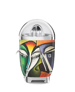
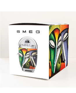
Illya Vereshchagin Juicer
Hi,
Apologies for the late hand-in.
The idea for my juicer was to simply make it look like its got texture underneath of thick paint, but glazed on the outside with a smooth surface. Design is meant to look good on a white background, so I chose a very colourful one to contrast well.
DaniellaHanabergh
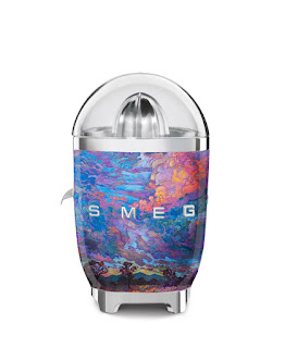
 For the design of this juicer I wanted the thematic to portray a more modern and personal appeal like something that is not only functional but also collectable. I have that my texture is a impressionistic painting called; Texan Sky III by Erin Hanson. This artwork not only remainds me a lot of quartz crystals which is something I really like but it also includes my favorite colors which although they aren't simple and minimalistic they contrast well with the "SMEG" typography.
María José Pastrán Barrera
Jeannice Dutari


